Hooray, SmugMug finally updated their website with some spectacular new layouts on the front end and much more easily navigable back end.
I joined SmugMug a little over a year ago (right before they upped their annual fees!) in order to set up an online store for my prints. For someone like me (i.e., a lazy person who doesn’t want to deal with the hassle of taking and filling orders), it was a godsend. SmugMug displays your photos, takes your orders, prints your pieces, and ships it all in the end. Perfect! Sure, they end up taking a pretty hefty percentage, but for now I feel like it’s worth it.
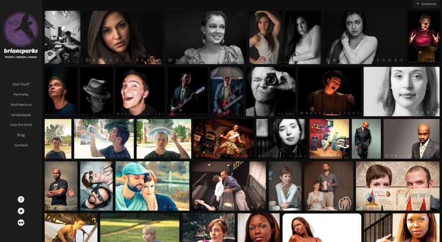
The biggest problem with SmugMug? It was U-G-L-Y. Even with custom CSS to make it match the look and feel of my website, there was only so much I could do. The layouts were limited and it all just screamed pre-millennial website design.

But all that’s changed now. It seems they’ve taken their high percentages and extra yearly dues and invested them back into their product, as it should be. The new SmugMug layouts are much more slick and modern (not to mention responsive!). And it’s all very much more customizable (with the majority of elements being drag-and-drop on the back end). While it’s still customizable with your own HTML and CSS, I found myself liking the new layouts so much, that I pretty much just went with one of their right out of the box.
I won’t go too much into all the new features, as it’s been covered outstandingly by the inspirational Von Wong. What I will add is that, while I’m still a little shocked they didn’t include proper blog support (you can finagle it by creating a custom “blog” page that only shows photos and items that you want to write about), creating a custom CMS that would rival the abilities and versatility of WordPress was probably too much to hope for (and ultimately, maybe something I don’t even want).
The only other thing that bugs me is that you can’t have randomly sorted pages/galleries. You can sort your photos by any other number of ways, so how hard would it be to add randomization?
Anyway, the other problem I ran into was that, compared with my slick new SmugMug portfolio, my own website looked a bit dated. That’s right, it was time to break out my CSS notes and get cracking on a new layout.
Now that I had a beautiful portfolio through SmugMug, I could steer my website more towards the blog side. The new site design reflects that and still ties into the SmugMug portfolio quite well. Special thanks to Site5 Themes for a great starting point in their free theme, Time. Instead of the days it took me to customize my last site, this one was finished more-or-less in a single night. The result is a much cleaner look and, maybe most importantly, a themes that’s responsive.
I hope you enjoy the new look, and of course, check out the new portfolio on SmugMug!


Leave a Reply